Monday, April 12, 2010

Loss Script/Storyboard

This is basically a visual runthrough of the film I plan on making this summer - entitled Loss:

LOSS


I slide back into consciousness and stare at the ceiling for a few seconds.
It’s just another day.
glance across. She isn’t there. Perhaps she’s already up. Perhaps she’s in the bathroom. *touches the bed beside him* She must have been gone a long time, her side of the bed is cold.
And once again it hits me…Her side of the bed is cold. It has been for the last 24 months.*sigh* Just another day.


 The whole conviction of my life now rests upon the belief that loneliness, far from being a rare and curious phenomenon, peculiar to myself and to a few other solitary men, is the central and inevitable fact of human existence.”
~ Thomas Wolfe

*Taking tablets at the sink* There’s a hole in my chest where my heart used to be. And for each day that passes without her, that hole grows bigger and colder. There was once a time when I craved love and compassion, now my withered heart merely beats for its daily dose of Fluoxetine and cheap vodka.
After living like this for so long, things begin to lose their colour. Even the brightest sunrise burns a lifeless grey. Clouds loom above like obscure shadows. Even the most beautiful of summer days are too bleak to put into words, because without her they are nothing. I miss her.

The world is a quieter place now, I drink ‘til my head goes numb and my ears start to ring, then I drink some more. That way I only have echoes of my own thoughts for company – it helps me get through the day. 

She used to love this park. It’s where we first met. Nowadays I come here in a morning to draw some breaths of pointless fresh air before I go in to get my prescription.

I'm not 'weak'! I can't just 'pull myself together!'

At home is the worst place. It’s where I think about her most.  Everything in this house reminds me of her.  Every object houses a memory.
The sounds.
The smells.
Even being here are enough to send flashbacks racing through my mind...

...At times I even think I can see her. Hear her. Feel her.
Perhaps I’m crazy.
How things used to be. 


I can’t bear to live here, yet can’t bring myself to leave. It’s unbearable. Yet somehow I feel obliged to put up with it.

It has been two years since her death and still I find myself trampled to the ground by my own conscience, unable to get back up. The guilt eats me alive as the disease did her.

I had let her down at a time she needed me most.  Turned my back and walked away, leaving her to die alone. I should have suffered with her; instead I blanked it out of my mind… too scared to face reality…. I should have suffered with her. And now I’m paying for my selfishness. In full.

They say that every kind of pain is good for you in small doses. But when you’re whole life is pain, and every day is a small dose. After two years of it you’d be willing to do almost anything to make it go away.

 At night I wish I could go to sleep without having to wake up.

The sad part is I do.

Another morning.

It’s in Chloe’s handwriting.

Robert.
 I miss you.
I am waiting for you.
In the place you took me last.
-Chloe x

This is real. 


Chloe: Look out over the water...


Robert: Im sorry Chloe... I'm so sorry...

Friday, April 9, 2010

Head I

This is Head I (1948) by Francis Bacon - an artist famed for his use of distorted and disconcerting imagery.

This painting adheres to many of the themes found in his paintings. Firstly, the subject is confined within a dark box/room, with thin white lines highlighting the edges of the walls and celing with the background filled in a single flat colour. This technique is often used in Bacon's work to place the emphasis on the subject.

The subject is a distorted and somewhat tortured looking figure resembling the shoulders and neck of a man. The most distinguishing features of this creation are the misplaced ear and chin (which are both disproportionate) as well as the twisted mouth, in which teeth protrude at unlikely angles. The fact that his mouth is wide open suggests that the character is experiencing discomfort, and may even be screaming. This touch makes the viewer feel somewhat uneasy, the desired affect which is commonplace in Bacon's paintings.

The top half of his head is not shrouded by shadows, but indeed missing - this shows that the man does not have a brain and is therefore incapable of physical awareness - thus making him more creature than man. This adds yet another disturbing dimension to this provocative image.

I really like the lighting in this image, the shadow cast underneath the monsters chin denotes that the creature is directly beneath a spotlight. This is supported by the illumination of the metal framework in the background, reminiscent of a French daybed. As many of Bacons paintings are described as studies, I believe the shading of his skin is intentionally "cut off" around his pectoral region. And the coloured detailing serves as a suggestion, to fill the empty space in order to simply balance the composition.

_____________________________________

Francis Bacon's other Heads.
Head II is a darker, and more sinister painting. This is more detailed rendition with heavier use of paint. The mouth is very similar protruding at the same angle with the teeth bearing direct resemblence.

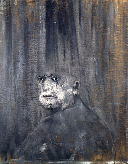
Head III is almost 100% human, with all distinguishing features in tact and even a pair of glasses. Like Head I - the top half of this mans head is missing. His shoulderline is also very similar, as well as place in the composition. The background features the trademark streaks found in many of Bacon's other works.


Head IV is similar to Head I & II as the man is screaming. This one again has a different background yet is still considerably flat with softer strokes. The thin white lines are present again, here they confine the subject to a transparent cube, sharing the same claustraphobic feeling as Head I. Of all the series, this painting exposes most of the body, clothed in purple.


Akira Trailer (1988)


This is the western trailer to Katsuhiro Otomo's Akira (1988), perhaps the most popular anime movie ever made. This trailer is visually lead and gives no clue as to the storyline other than "Neo-Tokyo is about to explode" - the rest of the trailer is comprised of fast-paced editing to portray a sense of anticipation. As the trailer gives none of the storyline away, it focuses on the film's setting...

The opening shot depicts chaos, a city street filled with fire and debris - this shot sums up the backdrop to the entire film.

The helicopter in the next shot suggests that the city has a degree of authority despite it's current state, and an effort is made to regulate the chaos.

The next shots include youthful bikers blasting through the city streets. This is a basic summary of the film's protagonists.

In typical trailer fashion, misplased explosions are included to grab the viewers attention, exploiting their lust for action.

The shot with the industrial lift descending into the darkness is a powerful and mysterious shot. Some of the men on the lift appear in labcoats, denoting their authority and responsible role within the film - a stark contrast to the wild bikers.

I particularly like this shot as it sums up the modernist design concepts within the film, of which there are many. This shot secures the belief that the film is set in the future.

This shot depicts a struggling father and child making their way through the streets. This has great relevence to the main plot, but holds little relevence to a first-time viewer. A powerful shot nonetheless.

I like how the blurred vision of the father (or child) is shown from a first person perspective. Creative shots like this were uncommon in anime films at the time. As Akira was cutting edge at the time, I feel that the trailer included this shot to showcase its animation techniques.

After some character shots, this is included. This highly sophisitacated machine looks almost organic, this supports the somewhat primitive background music, wich utilises wooden percussion - music like this is not often associated with futuristic design concepts. As a craft flies past the machine, the trailer cuts to another first-person view.

The armed response team are shown blasting a body to pieces with superior firepower. This is a rather shocking scene as the gore is very explicit. This tells the viewer that the authorititive figures within the film are willing to take extreme measures to regulate the mysterious happenings. Regardless of its content - this is an amazing piece of animation. I particuarly like the shading as the subject is direcly under a spotlight.

I believe his shot in the tunnel (which is superbly animated) was again included to showcase the cutting-edge animation. As the tunnel and explosion hold little relevance to the storyline.

This shot depicts a bizarre dream sequence taking place in a hospital bed, in which some toys come alive. I think this is a risky shot to include in a trailer as the audience have no reference to it. This shot alone could change some viewers perspective on the film, as it is rather unrealistic. Though it was clearly included to provoke a reaction.

This shot depicts a well-dressed elderly man looking down at a protest in a lower precinct. The larger, younger, and darker suited man carries all the trademarks of a bodyguard - and in fact is. This, along with his position above the crowd denotes the elderly man's authority.

This is one of my favourite shots in the entire trailer. It depicts a preacher in utter despair. In film convention, preachers of this sort often forsee formidable futures, this is used to denote that some form of apocalypse is rapidly approaching. A great shot to include.

Helicopters always denote militant authority. Here more are being deployed to counter the madness as the trailer nears its climax.

The final shots portray the transformation in personality of the main character - Tetsuo. Before he is consumed by light, this is the build up to the most important part of the film - the ending - which fittingly concludes this well paced and intriguing trailer.


Thursday, April 8, 2010

Snow!

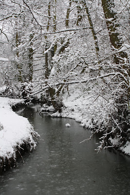
I took the following photographs on the 5th January 2010. I took these early in the morning before before the snow was trodden as the location (Hirst Wood) is popular amongst dog walkers etc...

This is the wier as the Aire intersects the wood. I particularly like how the snow-covered branches loom over either side of the river hiding the edges. I like the contrast between the running water and the smooth surface of the river, and how the bleak sky and white  snow make everything appear to share the same colour.

This image portrays a strong sense of place, the perspective of the railings almost invite the viewer into the thick woodland in the upper half of the composition.I like how the untrodden snow on this footbridge suggests that no people have crossed it, and how the viewer might be the first person to enter the woods.

The veiw of the stream from the footbridge. I took this to highlight the bend in the stream whilst showing the snow settle on the water.

I took this to show how the snow had settled on the branches. As this is the only feature in the entire image, the branches exit the frame on all sides. This is an image with a lot of texture.

This image captures the "Snowy Postcard Look" I had set off to achieve. I like how the tree on the left belittles the canal barge, moored to the towpatch which tapers off into the dense woodland giving the picture a sense of perspective. The shape made by the ice on the water in the foreground also gives the image a point of interest.
A landscape version of the same scene.

A closer look at the barge.

Similar to the image of the footbridge, I like how the snow is left undisturbed.


I decided to photograph this as I like the colour, not only did it really stand out from it's backdrop but was one of the few places the snow hadn't settled. The expression in the owner's handwriting and small illustration give this image a really personal touch.