Tuesday, March 30, 2010

Loss - Ideas

I am currently writing a short film entitled Loss.

The short but simple story I have written owes a lot to Silent Hill 2 - a survival/psychological -horror videogame released for the Playstation 2 in 2001. Not only is this one of my favourite videogames, but one of my favourite stories within a videogame. The story which inspired me to write Loss is outlined in the clip below.


Silent Hill 2 - Intro Sequence
(2:03 - 3:21)
My story is not too dissimilar. It follows a dilusional man named Robert. He is suffering the passing of his wife, who died of an illness some 2 years earlier. Chris has lived as a depressant alcoholic ever since her death, wallowing in the guilt that he didn't support her while she was ill - instead he chose to blank it out of his mind as he didn't want to face the reality of the situation.

One morning Chris finds a letter on his doormat. It is in his wife's handwriting. The letter states that his wife is alive and that she is waiting for him - "in the place you took me last." Although Robert is unclear as to weather or not this is a drunken illusion - he ponders the meaning of the letter and then drives out to the place he last recalls seeing her.

He drives out to the lake and sits on the shore. After a few minutes he notices his wife sat beside him, she is in her dressing gown. He tells her he is sorry and misses her madly. His wife looks away, then sternly tells him to look out onto the water.

After staring at the lake for a minute, Robert begins to see himself, up to his waist in the water. He is drowning a figure wearing a dressing gown. He looks to his side only to find she has disappeared. He glances back over the water, the vision has gone. Robert breaks down realising what he had done during the time he "blacked out".


____________________

As I am strongly influenced by the works of others - I am going to compare the stylistic elements I am going to incorporate with films I am particularly fond of.

Black & White:
La Haine (1995)

Firstly the film is going to be shot in black and white. As I mentioned in a previous post I am a particular fan of b/w films - stemming from my first viewing of Mathieu Kassowitz' La Haine. When used correctly, b/w can give a film a cold visual feel - perfect for the film I am going to make.

____________________
Use of Voice-overs:

Scene from Fight Club (1999)


The first half of the films narrative is going to be told in first-person. The voice overs will feature mostly cynical, neo-poetic accounts of events both past and present. Much like David Fincher's Fight Club (1999) the voice over will not only place the characters emotions at the heart of the story, but propel the narrative in a stylistic fashion. 90% of my narriative will depend on voice overs, at first I plan on building empathy between the audience and Robert right up until he discovers the truth at the films climax.


____________________


Mirror Sequence:
Silent Hill 2 - Playstation 2 (2001)

My film is going to include a mirror sequence in the first half, in which Robert takes his medication and tells the audience of his drinking habits. It would be hard to draw influence from my favourite mirror scenes (La Haine, Taxi Driver) as they both include a degree of hostility and the characters talking to themselves. Instead, I will aim for the more subtle actions found in the intro sequence to Silent Hill 2.

____________________

Drowning Scene:
Don't Look Now (1973)

Favourite isn't a word that should be applied to any scene involving the concept of drowning. However, the scene from Nicholas Roeg's Don't Look Now is the one I aspire to most in terms of realism, controvercy, and of course shock value. Although the action is different, I aim to transpose  these elements into my films climax for full effect.

____________________

Photography:
Sonatine (1993)
Dolls (2002)
Kids Return (1996)

For shooting this film I am going to look towards the works of Takeshi Kitano, as you can see from the stills above his style is very simplistic, minimalist yet effective. I am going to incorporate this into my film to give it a very simplistic style. Similar to Kitano, shots will be overly long with characters walking in and out of frame.

Monday, March 29, 2010

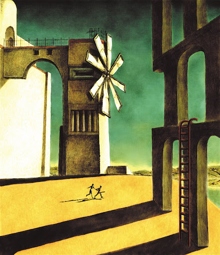
ICO - Cover Art


This is the European cover art for the surreal adventure videogame entitled ICO (Playstation2, 2001). This cover art was painted by the designer/director of the videogame himself - Fumito Ueda.

  
Fumito Ueda^
Giorgio De Chirico^
As demonstrated in the comparison above, this painting is a direct homage to Greek-Italian surrealist painter - Georgio de Chirico. Ueda uses the typical colour palette found in De Chirico's more famous paintings, consisting mostly of yellows and orange with contrasting blue sky, which is often too dark for the colour of the ground which suggests brighter sunlight than portrayed.

Along with the colours, Ueda has adopted many other De Chirico trademarks. The scene is set in an inhospitable desert at around sundown. The shadows are cast at irregular angles and provide heavy contrast with the colour of the ground. Due to the feel of the painting, the building in the background appears seemingly unoccupied. Archways are a common feature in almost all of De Chirico's landscapes involving architecture. The only architectual differences are the windmill and the ladder - neither of which were ever painted by De Chirico. Fumito Ueda painted the windmill structure as homage to an area within the game itself. I believe the ladder is included in this composition as ladders are a key element throughout the game, and suggest that the game's gameplay emphasis lies on exploration and puzzle solving - the latter enforced by the mysery of the painting itself.


ICO - Protagonists^
Figure in Di Chirico's painting^

Also, the two characters in Ueda's painting (The game's protagonists) bear direct resemblence to the girl in De Chirico's Mystery and Melancholy of a Street (1914). Not only are these two portayed as 90%  silouhette's, but their shadows and posture in motion are almost identical.

___________________________________________________

Use as an unconventional cover:
 
American cover in comparison to European.

In comparison to the vast majority of videogame covers at the time, the European cover for ICO was unlike any other. Not only was it a departure from the digitised representations of in-game characters seen on 90% of videogame covers, but it used subliminal messages to give an insight into what the game entails. Strangely enough, it was this cover which made me pick the game up, buy it, play it, and love it.

Sunday, March 28, 2010

VSH ADVERTISMENT

Victim Support Helpline Advertisment


I made this in 2007 as a college project - I was asked to produce a 30 second television advertisement for a fictitious drug support/awareness service. The project also had a corresponding billboard poster which I sadly cannot find to upload. This was one of my earlier efforts at video production and is not without faults:

 Firstly, there is a blatant crossing of the line in which the first character walks past the tunnel to his left, only for it to appear on his right in the following shot. During the editing process I cross-faded these two clips in a vain attempt to disguise this error - though it aided in distracting the viewer for a second - the mistake is still profoundly obvious. I am not happy with this at all.

Secondly, a number of the shots are underexposed, the transition from dark>light>dark shots disrupts the flow of the trailer. This fault is partly down to limitations of the Hi-8 camcorder, as well as my general inexperience. This also impeded on the impact of the final shot which featured heroin paraphenalia (a lighter and bent spoon) in the foreground. The darkness made this detail almost un-noticeable, removing all relevent connotations from this shot. Nonetheless I am pleased with the final shot as it is rather dramatic due to the water and debris drawn in from a recent flood. This was not present when we recce'd the tunnel the week before and was a pleasant suprise upon arriving to shoot.

_____________________________________________

 
Working with black and white:
^La Haine (1995)

I have been a particular fan of black and white since I first watched Mathieu Kassowitz's La Haine - this film proved that b/w can be very effective in portraying drama, and inspired me to shoot the advert the way I did. This film has since had an influence on my photography, and is the technique I will employ in my next film...

A.O.T.B.K

ATTACK OF THE BITCHSLAP KILLA

(Blogger has cropped this, double-click to view in YT)

"Attack of the Bitchslap Killa" is a short video project we made for the Conventions in Videography  module. After first dwelling on making a Bradford-based zombie trailer (Bradford of the Dead), we soon settled on this idea in favour of less makeup, less extras, less mess, daylight shooting, and of course the opportunity to make more jokes.

From the nemesis' point of view we wanted this film to bear resemblence to blaxsploitation cinema, particularly in regards to "The Mack" (1973) and "Superfly"(1972). In order to do so I obtained a joke-shop pimp suit for our nemesis' costume - an essential part of the trailer. Although elaboratly stereotypical, it still bears resemblence to the outrageous clothing featured in "The Mack" along with the quinetessential gold-topped cane.

                      Gold-topped cane ^
^Screenshots from The Mack (1973)
^Screenshot from Bitchslap Killa

I also ensured that the backdrops resembled the typical run-down cities in which most of these films are set. As I had photographed some of Bradfords most run-down areas in the past, I had a good idea of which locations were ideal in terms of looks, and how quiet they were for shooting in public. I aimed for a visual match of the streets found in the chase scene in Superfly (1972):

(Chase scene 8mins57-9mins55)
(Titles 5mins24-7mins57)


As well as the backdrops, I ensured that the style of the trailer adhered to the conventions of Blaxsploitation trailers. I applied a customised brown filter to the video to make it appear older, as well as the titles, which were also inspired by Sig Shore's Superfly:

^Titles from Superfly (1972)
^Titles from Bitchslap Killa

To round the trailer up I stayed true to existing blaxsploitation trailers in regards to the music. Our film featured the score taken directly from a blaxsploitation martial arts movie - coincidentially entitled "Black Belt Jones". I particularly like this piece of music as it fuses funk with orchestrated 70's movie score.

Friday, March 26, 2010

A.O.T.B.K - Comparisons


This shot was ad-libbed on the day.


Replacement for dumpster scene.


Scripted but not storyboarded*


Scripted but not storyboarded*

Scripted but not storyboarded*
Clip from Vanishing Point

Scripted but not storyboarded*

Ad libbed on the day*


Clip from Vanishing Point*